• You are viewing the forum as a Guest, please login (you can use your Facebook, Twitter, Google or Microsoft account to login) or register using this link: Log in or Sign Up

IAPLC 2024: World Rank #22 - 'Closing' - A Journal on Contest Aquascaping

Tom, this was a terrific post, a terrific iwagumi, and a terrific write up of your thoughts, and state of aquascaping overall. I'm sure it's in part because we share a teacher (Masashi Ono) and also in part because of your clear passion to learn the art of contest scaping, we share much in world view and view of the contests. This thread was fascinating enough that I had to login to my old UKAPs account. haha
(Even until today, I lament that Forums have fallen off in favor as the discussion platform of choice for hobbies-- forums > Discord 1000%)

I understand many of the sentiments in this thread-- Luca and Trinh Ha Le's layouts are my 2 favorites as well for instance. With both praise and critique for the IAPLC this year in the thread, I will have to throw my hat in with the side of "praise". I didn't know about the change in the steering committee procedure-- it's wonderful to hear ADA be responsive. I would say that it would be very hard to argue that IAPLC 2024 reaches the heights of the contests' history (still IAPLC 2016 imo, where peak/extremely high level of most of the styles we're discussing are ALL represented in the top7-- Diorama, NA, crazy gimmick, Brazilian Stone, Indonesian Forest); but the top 100 show me many layouts that demonstrate a playfulness or breathing room to welcome creativity that's very encouraging! It makes me want to try hard to enter next year.

I don't feel I have a good read on CIPS, but with KIAC I feel like compared to IAPLC, the top makes me feel the contest's passion, and drive to establish itself as a serious platform for the art. This is good-- I can applaud both KIAC striving to establish itself as a serious platform, and IAPLC opening creativity by in a way, NOT taking itself TOO seriously. These contests are at different life stages.

Personally, I feel that worrying TOO much about the rubric is a bit of a trap, as interpretation of it is very subjective on all parts-- on our part as fans/contestants, on the judge's part, and on contest staff's part. What feels "natural" to some, is not to others, and then there's the issue of language-- where ADA is a very Japanese company, and the meaning for these terms in Japanese has entirely different (and once more, subjective) interpretation. But then does the Japanese interpretation get translated perfectly for the foreign judges? (impossible) It's all interesting to think through, but best for folks not to worry too much about it all imo.

It's also probably best not to assume that any given style has a monopoly or even significant advantage on parts of the rubric, or even in things like "natural feeling". I would highly disagree that any style can lay claim to such.

On underwater feeling, the reality is that despite many top aquascapers pursuing heavily "underwater feeling" with literal "underwater environments", the top of the contest has not become a monotony or even highly populated by these Biotope-Inspired-NA layouts; or else scapes like the Masashi Ono one and Josh Sim one you posted earlier would have been Top 7 works, and not fallen-out of the top 100, or mid-100 respectively. While I also love (and make) those styles of scapes, I would not want them to be the only types of works rated highly at the IAPLC. Everything becomes a bit too easy-- aquascaping as an art is best if there's something challenging to contend with; no easy answer. The "answer" to what makes a great scape should be at the individual work level, not the style-type level.

I'm sure Tom has read me say this in a number of places, but it's important to remember that Amano himself was a radical. A scaper like Jun Itakura is an incredinble steward of Amano's form, but Itakura-san could never have been an Amano, and if Amano had been a conservative thinker like Itakura-san, we would all be either not doing this hobby or doing a much smaller Dutch-Style Contest loyalist hobby. Amano's own judging is part of what drove the Diorama scapes onto center stage alongside NA, with Amano himself picking Dioramas on multiple occassions as "Best in Show," including by TAU members Toshifumi Watanabe's mountain scape and Takayuki Fukada's 2015 GP, "Longing," the last contest judged by Amano (and funnily, both of them our fellow students of Masashi Ono). For me, the biggest impression of the man and his legacy will always be when I went to NA Party 2009 and hearing Amano-san say to us foreign guests at the Gallery, "What was this contest? What was this??? Every work this year was just a copy of something I've already done. I opened a world contest to see great new scapes inspired by all the world-- and what has the world shown me? nothing. NOTHING. Come on people- show me something new."
Steven - thank you so much for your kind words! I didn't expect this response and it really means a lot coming from you!

For sure, Masashi Ono has been the biggest influence for me since I decided to take the step into contest aquascaping. I can't thank him enough and I will get the opportunity this year to finally meet him in person! I'm sure we will speak about you, as well as have many great discussions on aquascaping philosophy (which he couldn't teach me over Facebook)!

I personally feel the adjustment to the primary screening process is a massive change and gets over the core issue some aquascapers had with the contest. This being the overall consistency of the judging between the primary and secondary screening phases. Arguably, there were more notable absentees this year from the IAPLC, Matthew Manes and yourself to name just a few, so the quality of the contest definitely has a higher ceiling than what is shown through the winning works this year.

As you mention, it's not the golden era of the IAPLC (2015-2017) but I do feel it is not past its best yet! For me, post-2017 to date we have seen many similar compositions replicate aspects of the top works seen during that time. I feel this was a 'safe' way to secure a good score. However, more recently we have seen 'riskier' layouts being undertaken with a shift towards more pure NA/ biotope influenced designs. Although we are really yet to see them being rewarded in the top rankings!

As an NA guy myself, I'm hoping this day will come, but I do agree with your view that the contest should support a variety of layout styles! For one, I would love to see the day a pure biotope design wins the IAPLC over a crazy diorama layout! It makes it more challenging, something to strive towards.

On the KIAC, I thought it had the best aquascape this year (Trinh Ha Le's work). I was however a bit disheartened at the lack of NA and iwagumi layouts in the top rankings. Don't get me wrong, all were high quality layouts worthy of the top rankings, however all had a very complex compositional arrangement! I didn't see many with the elegance of a simple iwagumi with flawless execution for example. For me, Masashi Ono's KIAC work captured a unique atmosphere not many other layouts did. This would have ranked top 100 in the IAPLC (something I have joked with him about!). I feel KIAC is going the way in the sense that it caters to a certain 'type' of layout. There is no problem with this as it differentiates it from the IAPLC, but perhaps the IAPLC is more 'rounded' in that sense.

On the rubric for the IAPLC, I didn't think about the language barrier (for one of a better word!). I personally don't have an issue with the judging criteria, although trying to work out it's application in layouts is a bit puzzling at times! I know some aquascapers feel it is too broad. However, if it becomes specific I feel it might deter many contestants applying to the contest for the first time. It also needs to be beginner friendly, not just a contest for pros!

Aquascaping is also an art form, so the more detailed the judging criteria the more you remove the subjectivity of the contest and the more it becomes a part of academia! I prefer if it stayed as it is and judges reviewed layouts on the 'feelings' they have towards a work. If a layout hits home, it should get a good ranking (no matter if some of the technicalities or details could be improved)!

As you mention in your last point, Takashi Amano was entrepreneurial in the sense of welcoming new styles to the contest. Without risk, there is no reward and I hope we see this shift in mentality in the works next year!
 
Last edited:
Personally l don't think you will ever get a set of judges in any field to suit everybody . But to see a planted aquarium contest for no CO2 would be interesting and give people with perhaps less time and maybe finance to enter
Agree! This would be good to see and a stepping stone for many into contest aquascaping!

This is a great journal Tom, an intriguing and informative insight into contest scaping. Thanks for sharing.
No problem mate! It's becoming a bit more detailed than I originally expected but I hope it's an interesting insight (with the caveat that I still have much to learn myself!)
 
View attachment 223117

Here are a few examples of aquascapes that I think are over-rated this year, but maybe it’s just the fact that with ‘only’ 1450 entries they made it to the top, and this wouldn’t have happened last year?

As I said before, I’ve the feeling that the main thing to have to make a nice tank at iaplc now is :

-big tank (minimum 90, ideally 120-150cm)
-nice photo
-good plant health
-luck

I have this feeling of randomness that doesn't even make me want to try anymore, even if I had a large aquarium.

Ps: I laughed at Steven post because of Amano quote back in 2009, The kind of sentence that motivates you to get out of your comfort zone!
I think those factors are pretty much the same to secure a good ranking in any aquascaping contest!

Good photography and plant health are actually two of the key things to master in order to get the top rankings! Unfortunately, it's not possible to show the judges the aquascapes in real life, so contest aquascaping is as much of a photography contest as it is an aquascaping one (hence why it's one of the topics I'll be covering in this journal!).

There are a few works you selected that I really liked! Yes, they are similar to what has been done before in terms of their composition, but the level of execution and details is what got them the high rankings. I think this is where the subjectivity of the art form comes into play. Everyone will have their own opinion and we must respect the judges decisions.

I'd like to add that even if my tone sounds like that of a guy who's frustrated that he's only managed to get into the top 100 once (which is a bit the case because I haven't managed to draw any logic from the ranking of my aquascapes and as a result I haven't managed to rank consistently every year), I like the fact that the iaplc encourages diversity and risk-taking, but also the fact that with a nice iwagumi or another simpler style like the NA you can reach a top 100 or even 50.

I think that at one point I took this competition far too seriously, I didn't realize that whatever the ranking, each of my aquariums had given me something and I'm also proud to have tried a different style each time and not to have stayed in my comfort zone.

Cheers
I relate to this a lot! I appreciate you putting your views on the table as it's created a great discussion around contest aquascaping and the IAPLC in this thread (it's even brought Steven Chong out of his UKAPS retirement! 😅).

At the end of the day, I see the ranking as the cherry on top (it is not the be all and end all!). The journey means much more than the end result. That is why I wanted to highlight the aquascaping community as one of the highlights for me. We all share the same passion and its important to also challenge ourselves through gaining feedback from others and trying out new styles.

P.S. Part 3 on HARDSCAPE DESIGN coming this weekend...stay tuned!
 
3. HARDSCAPE DESIGN

This is what I like to think of as the skeleton of an aquascape. Importantly, it serves as the framework for planting.

There is a lot of theory and many great workshops that discuss techniques on how to improve a HARDSCAPE DESIGN. None more so than Josh Sim's Green Aqua Masterclass. I won't repeat the techniques discussed in this video, but I hope to add my take on a few things which weren't covered in detail (with a focus on Iwagumi layouts!).

Firstly, for me the most crucial part of any HARDSCAPE DESIGN is the balance between the hardscape and the negative space (or what is also referred to as the open space in a layout). The key thing to avoid, is a layout feeling 'oppressive'.

What do I mean by this? Well it's the feeling of a layout being too stifling, closed or heavy in its overall impression on the viewer. Many contest aquascapers consider the hardscape the most crucial part, and it is true that it is one of the key elements in order to create a big and everlasting impact. In order to create an impact through the hardscape, this requires large pieces of wood or stone to create a structure where the majority of the tank is filled (think of the tank as a 3-D cube that is divided into even segments left to right, front to back and top to bottom, each segment plays a role in contributing to the overall impression of a layout). However, it is very easy with this approach to add too much hardscape in the hope that this creates the desired impact. You will end up with the layout becoming too 'flat' with no sense of depth, perspective or layering! The aquascape won't be inviting for the viewer. Returning back to Part 2 of this journal on IDEOLOGY & CONCEPT EVOLUTION, arguably the sketching of an initial layout design would help to serve as a useful reference point to avoid this issue.

However, if you're like me and you prefer to work more freely, then I find it more important to focus on the impact created through the negative/ open space, rather than the hardscape itself. This is because the first thing that captures the eye of the viewer is the end point of a layout. It acts as the anchor point for where they focus their attention.

Most of your effort should therefore be around the end point, through the techniques mentioned in Josh Sim's Masterclass (such as creating perspective, depth etc through the positioning of the hardscape to enhance it's impression). Combining these techniques to find the appropriate balance of a heavy and light hardscape impression is a good way to improve your aquascaping skills.

For me, during this process it helps to think in extremes. You want to incorporate bright/dark, heavy/light, big/small and near/far aspects into your work to add interest and different layers.

I personally prefer to try endless combinations in my dojo to ensure I show the hardscapes best 'face', before transferring it to the tank. If possible, I would complete the hardscape in my dojo to make the transition to the tank as straightforward as possible.
IMG-20240529-WA0011 (1).jpg

Iwagumi

Different aquascaping styles focus on HARDSCAPE DESIGN in different ways.

For classic Iwagumi layouts, less is usually more when it comes to the stone arrangement. When I say 'less' I do not mean there should be swathes of negative/ open space (this will not create a big impact), but instead there should be an appropriate balance between the main and supporting stones.

To understand this concept in more detail, it is important to have a grasp of the stone types in an Iwagumi layout and the role they play in contributing to the overall impression:

- Oyaishi: the main and largest stone of a layout. This is generally placed at the golden ratio point and should tilt in the direction of the water flow.

- Fukuishi: the secondary stone. This should resemble the main stone but be smaller in size and used to balance the impact of the Oyaishi. It is often used to create tension in the layout.

- Soeishi: used as the tertiary stone and usually placed alongside the Oyaishi to accentuate its power. It is the third largest stone in a layout.

- Suteishi: these are supporting stones which are not meant to stand out, but can be used to bring an overall balance to the layout.

In the ADA videos of the past, Takashi Amano would place stones and then remove them from the tank to find the perfect balance. He would normally do this with the Suteishi stones once the other stones are fixed in position. This is a great method as the best Iwagumi layouts will have just the right number of stones to create a harmony between the hardscape and negative/ open space. Too many stones and you take away from the impact/ power of the Oyaishi.

For Iwagumi, there is however a higher margin of error as every stone has its place and is contributing in some form to the overall compositional balance. For me, mastering this technique and knowing when to 'stop' adding or removing stones is aquascaping in its purest form and is a way to add a sense of elegance to the work. This is notably different for wood-heavy layouts, where there is arguably more flexibility as each piece of hardscape has less of an impact on the overall impression.

One thing which helps me to understand the philosophy of Iwagumi (and has improved my knowledge in creating them) is to refer to the 3 traditional styles. These have also been adapted to form modern variations seen in contest aquascaping. The 3 styles of traditional Iwagumi and their successors is set out below.

Radial
Traditional
An Iwagumi where the stones are arranged radially from the focal point to the four corners of a layout. Can be used in both the 'underwater' and 'landscape' styles.
20200626_suikeiwords01_001 (1).jpg
Successor
Not regularly seen or interpreted in modern contest aquascaping. Closest evolution of this style is Luca Galarraga's arrangement below used in a Brazilian-style contest aquascape. It creates a dynamic layout with a strong sense of perspective towards the end point. I also adapted this style for 'Closing' (something I will cover below!).
iaplc2020_07_01.jpg

Sanzon
Traditional
Literally meaning 'three-pillared rock formation'. This utilises the Oyaishi, Fukuishi and Soeishi stones. Closely resembles the rock formations of river beds and therefore has an 'underwater' feeling.
_20241012_100323.JPG

Successor
The evolution of this style is seen in many ADA aquascapes. It utilises two or even three groupings of Sanzon to create a Iwagumi composition which flows left-right or right-left with a strong sense of water flow.
20200626_suikeiwords01_002_en (1).jpg

Hilly
Traditional
An Iwagumi where the substrate is banked up high on both sides in line with the golden ratio to create the sense of a vast landscape. Smaller stones are usually placed to resemble mountains in a distant and panoramic view. Used for the 'landscape' style.
20200626_suikeiwords01_003.jpg

Successor
The Brazilian-style is a modern take on this and is used commonly in aquascaping contests.
To my Friend in Heaven.jpg

Although it is important to understand these traditional Iwagumi styles and use them as guidelines, it can be a bit of a 'red-herring' to restrict yourself to their strict compositional arrangements as you will likely end up creating an Iwagumi that has been done before. You will notice the 'successors' are similar to the 'traditional' styles but add an element of complexity which creates more of a unique layout design. This is important to achieve the top rankings, as you need to showcase something different.

Instead, I therefore find it useful to focus more on the following 3 elements (whilst using the traditional layout styles as guiding principles):

1. Impression of the two main stones (Oyaishi and Fukuishi);
2. Direction of flow; and
3. Gravitational position of the overall stone arrangement.

The order I have listed them in is also the order of importance. For example, the third element is less important if you are creating a Sanzon Iwagumi, where the direction of flow is from left-right or right-left and so the gravitational position of the stones is relatively similar along a horizontal axis.

I find that focusing on these 3 elements helps me to decide the size, shape and direction of the supporting stones which balances the overall HARDSCAPE DESIGN.

To explain these diagrammatically, let's take a closer look at my HARDSCAPE DESIGN in 'Closing'.

Spotlight on 'Closing'

My IAPLC 2024 layout this year was based on the guiding principles of a Radial Iwagumi.

Untitled72.jpg

Due to the aspect ratio of a 90p, I felt this IWAGUMI style best suited the tank size as it is most similar to a U-shaped composition (and provides less of a panoramic view which is suited to larger tanks).

The downside with using a 90p for a Radial Iwagumi is the end point will inevitably be more central. This has the tendency to create a symmetrical layout, which doesn't look natural as it more closely resembles a 'man-made' structure. On reflection, I struggled with this aspect in 'Closing' as you will see the Oyaishi and Fukuishi were very similar in size and created a form of symmetry in the HARDSCAPE DESIGN (with the position of gravity being very similar along a horizontal axis).

In an ideal world, an Iwagumi should incorporate Oyaishi (A) > Fukuishi (B) > Soeishi (C) and not Oyaishi (A) = Fukuishi (B) = Soeishi (C).

The positioning of the Soeishi however helped me to create a heavier impression on the right side of the tank. I tilted this stone backwards to create a sense of tension, to ensure it was positioned in the opposite direction to the other stones (which were all tilted towards the front corners to create a dynamic perspective pointing away from the end point).

The diagram below shows the overall impression of these elements in a visual sense, whereby:
  • Red circle: End point
  • Green line: Height of the stones (positive correlatation to the overall impression of the stones; higher the stone = more impression /impact)
  • White arrow: Direction of flow (larger arrow = stronger sense of flow)
  • Blue dot: Gravitational position of the stones
Untitled74_20241012130906.jpg

The final HARDSCAPE DESIGN and transition from the dojo to the tank can be seen below.

1. INITIAL LAYOUT AND VISION
DSC01438.jpg
IMG_20230414_095324_376.jpg

2. TRANSITION TO THE TANK & AREAS FOR IMPROVEMENT
received_141345542315343.jpg

3. FINAL HARDSCAPE
DSC01626 (1).jpg

Part 4 on PLANTING, MAINTENANCE & ADJUSTMENTS coming soon...
 
Last edited:
4. PLANTING, MAINTENANCE & ADJUSTMENTS

In this episode, I will touch on these three areas to progress your work from HARDSCAPE DESIGN to FINAL PHOTO. Let's take them in turn!

4(a) PLANTING

This is what I referred to earlier in the series as the paint pallete used to bring your work to life! 🖌️🎨

Plant health, plant integration and plant selection are all factors which play a key role in the overall ranking of your work 🌱

I've however noticed that many aquascapers tend to rush this step and don't put as much time into choosing their plants compared with the HARDSCAPE DESIGN stage. Leaving not enough time for planting usually results in a lack of maturity/ integration for the FINAL PHOTO.

In the past, I would wait until the HARDSCAPE DESIGN is flooded and 'throw' plants at it in the hope that it creates the desired vision. I have learnt through trial and error that it is very easy to 'overdo' it by adding a lot of different species. This generally creates a confused planting arrangement with no sense of unity. The colours, textures and size of each plant should work in harmony to create a natural look. Takashi Amano famously said, "If you plant a particular species on the right side of the tank, you should also plant it on the left". The key is that the plant selection should be linked to the overall theme of a layout and should help to tell it's story.

Taking a look at Aquasabi.com for example, there are over 500 species available in the market. So why should we limit ourselves to using the same type of plants that are readily available over and over again!

For me, I like to start brainstorming ideas for planting at the IDEOLOGY & CONCEPT EVOLUTION stage. For example, in my previous IAPLC works which were both focussed on a geographical region, I would limit my scope to plants found in that part of the world. For 'Closing', I took a different approach and decided to begin with a specific combination of plants, not geographically related, but connected through the works of Takashi Amano.

Yes, you can create a unique layout through the HARDSCAPE DESIGN, but PLANTING can also be used to create something unique. A great example of this is 'Red Alert' by Nobphacha Yimyou, which used nymphaea in a unique way to grasp the judges attention and achieve rank #4 in IAPLC 2023.

img_4_1693051372872.webp

In 'Closing', this too was centred around the PLANTING to connect my work to my chosen theme. I wished to pay tribute to Takashi Amano's early Iwagumi creations by using 'traditional' plants such as riccia, eleocharis and glossostigma. I therefore used this strict plant pallete, with the overall goal to create a 'wabi-sabi' feeling using only three species.

Despite the limited plant selection, I believe it's simplicity helped to create an elegance and a sense of nostalgia which was not possible through the HARDSCAPE DESIGN alone. Without this plant selection, there is no connection to Takashi Amano's early works.

I found it useful to sketch a planting plan to ensure a layout stays true to the overall theme as it matures. For me, this is one of the most important steps as I try to make this as detailed as possible to use as a reference during maintenance 🖌️📝

Untitled67_20230802085533.jpg

4(b) MAINTENANCE

The MAINTENANCE stage is less about creativity but more about 'going through the motions' to keep on top of the overall vision for the aquascape.

This is the stage where a good routine is essential to ensure you dedicate enough time to the day-to-day husbandry. Consistency is key through small and frequent water changes to keep water quality stable.

For me, reflecting on my planting plan helps to focus my attention on the vision I want to create. This ensures that I keep on top of plant maintenance in a way which matches the vision in my planting plan, removing any wavering from the end goal 🎯

I also like to cut down on the MAINTENANCE required during the first month of an aquascape by doing a 'dark-start'. More details are provided in my rough guide to MAINTENANCE below!

Water Parameters 💦

TDS: 80-110ppm
RO Water, remineralised using Sera Mineral Salt and Sera GH/KH plus at 60:40 ratio

Temperature: 23°c

Aeration: After the light is turned off using lily pipes

Weekly Maintenance Guide 📋

Week 1-3: 'Dark-start' cycling of the tank (filter running with aeration through lily pipes. No plants, light or Co2)

End of Week 3: Planting

Week 4 onwards: 30% water change every 3rd day siphoning any detritus build-up. Refer to planting plan every fortnight for trimming/ maintenance (more regular at FINAL PHOTO stage). Filter maintenance varies (done when reduced flow is noticeable).

4(c) ADJUSTMENTS

Generally speaking, the ADJUSTMENTS stage is relatively simple, as long as you have a clear theme, good hardscape and detailed planting plan.

For me, any ADJUSTMENTS are usually as a result of wanting to improve the reflections after the HARDSCAPE DESIGN is flooded. Usually, this is related to the side reflections of the tank as these are hard to judge without the presence of water. For 'Closing', I changed the angle of the stone on the left side to make this side reflection more prominent and the overall layout feel more panoramic than the true tank size.

I also find it useful at this stage to ask the AQUASCAPING COMMUNITY for feedback. They will be able to tell you what's worked and what hasn't against your initial concept and this will help to elevate your work to the highest level.

Part 5 on PHOTOGRAPHY coming soon...
 
Last edited:
5. PHOTOGRAPHY

PHOTOGRAPHY goes hand-in-hand with contest aquascaping. At the end of the day, the only part of an aquascape which is judged in a contest is the FINAL PHOTO 📸

A good photo is therefore the platform used to showcase your work to the judges. It is also very much a separate skill and somewhat disconnected to the everyday maintenance of a fish tank 💦

I won't go into the details of PHOTOGRAPHY techniques (ISO, aperture, shutter speed, focal length, exposure etc.) in this episode as this information can be easily found online and is very much a topic in its own right! However, I will touch on why I believe PHOTOGRAPHY is an important topic for contest aquascaping and why I personally feel it doesn't get enough attention in the AQUASCAPING COMMUNITY.

For me, a photo can make or break a layout. I assume that the majority of people who get into aquascaping do so through their love of fishkeeping, nature and plants. Rarely is it through a PHOTOGRAPHY background.

Smartphones have however made it easy for people to take photos and showcase their work through social media. The use of filters on apps like Instagram means that many photos can be ‘touched-up’ to create an aesthetically pleasing effect. However, not many aquascapers I know have a mirrorless camera or have tried their luck at professional photography. It’s only really when you need to take the FINAL PHOTO for a contest that you really start to think about it!

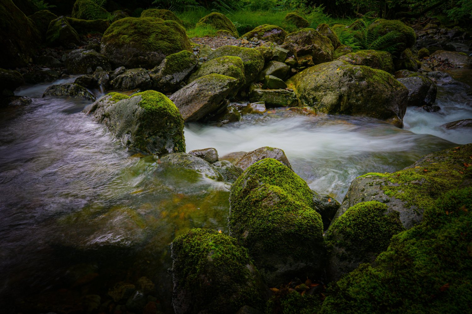
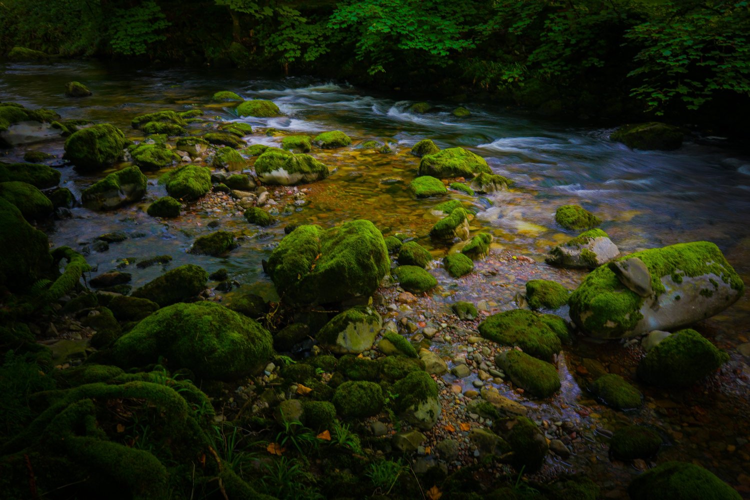
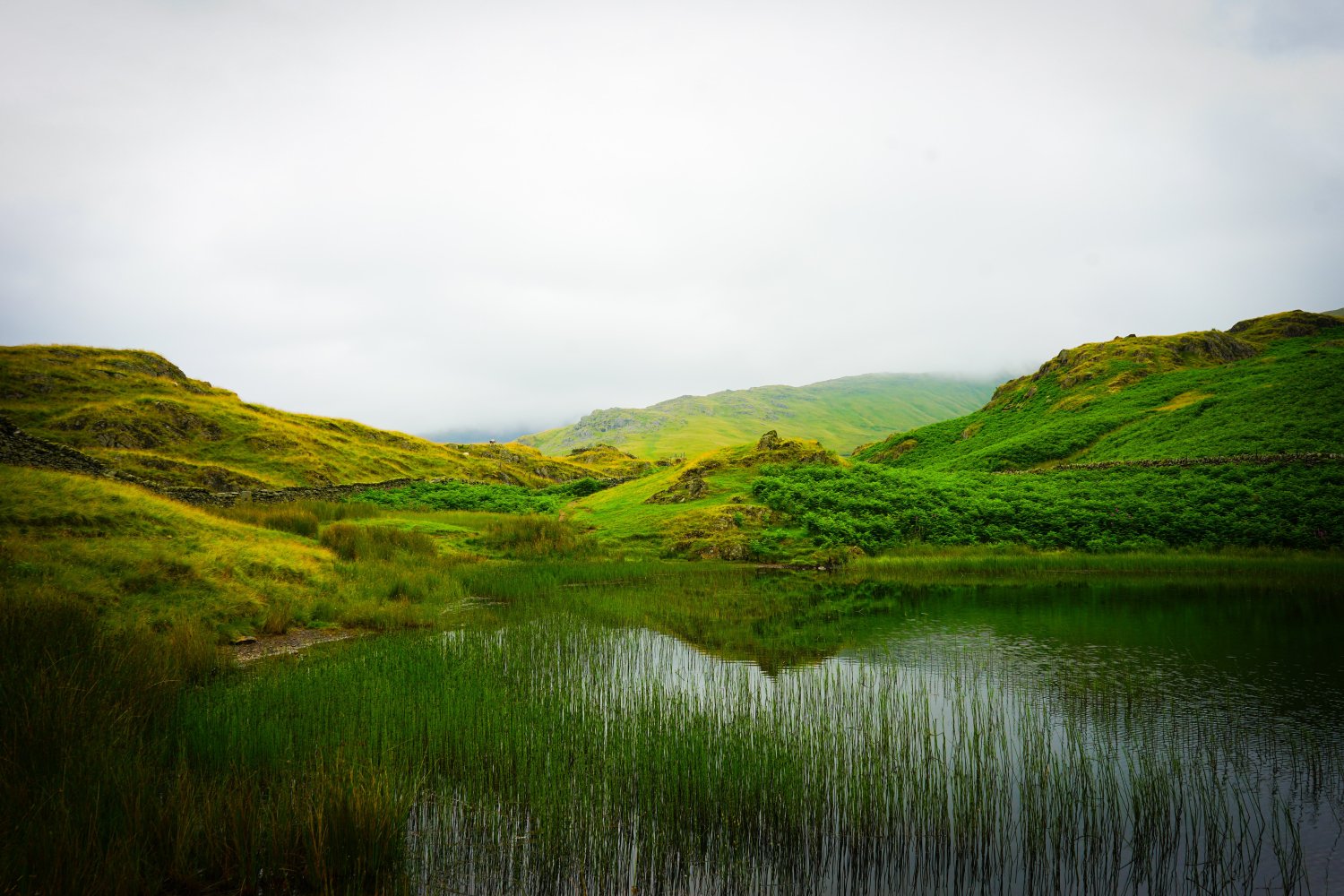
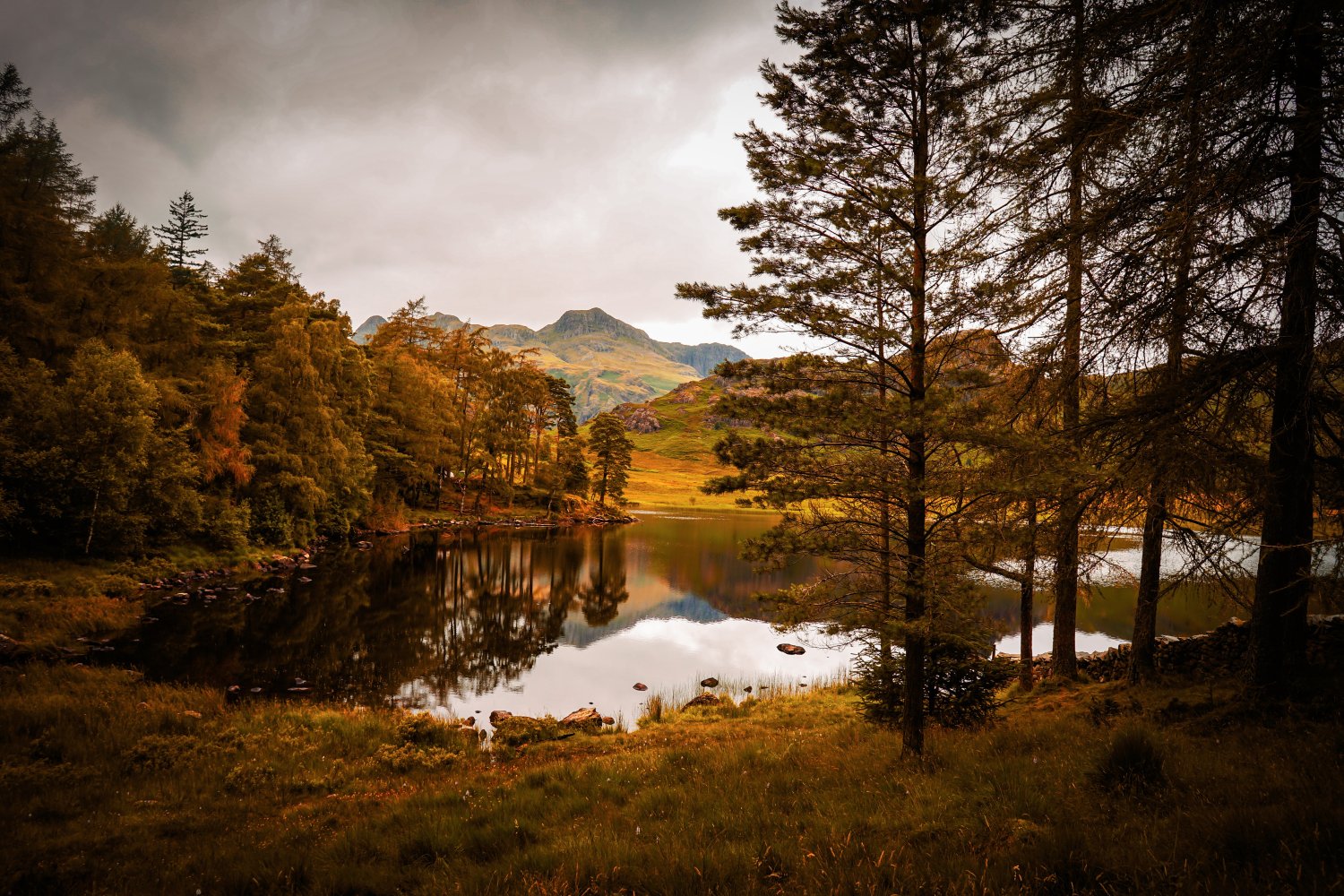
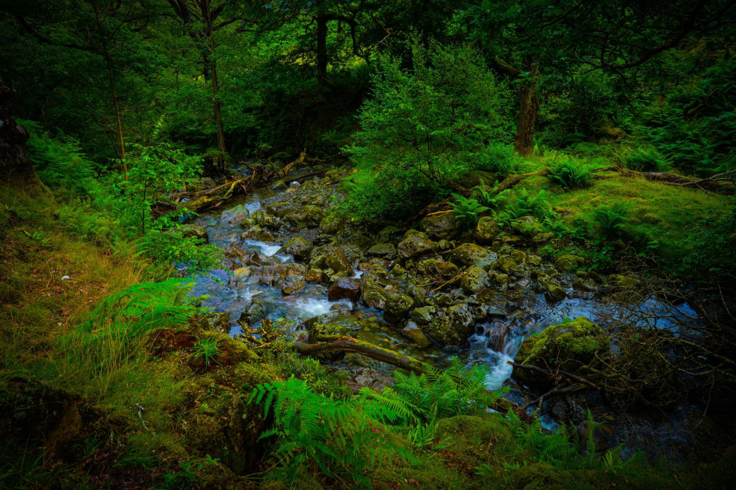
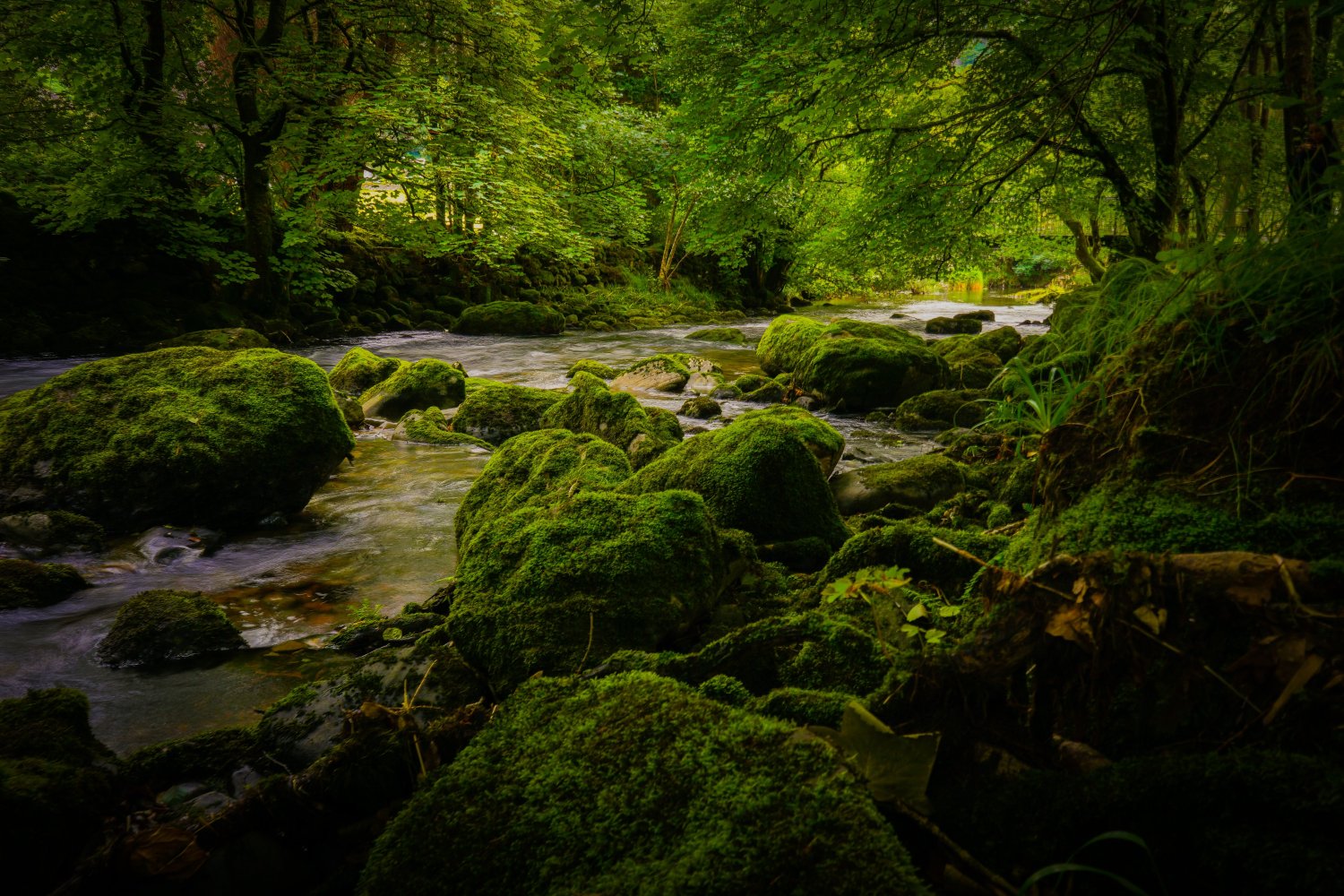
When I decided to take the step into contest aquascaping three years ago, I reached out to Masashi Ono over Facebook to ask him what it takes to achieve a top ranking in the IAPLC. He mentioned that PHOTOGRAPHY played a key role and recommended that I purchase a mirrorless camera and explore nature for inspiration. As with anything, the more you practice, the better you get at it and it is the same with PHOTOGRAPHY. As a lover of nature myself, I therefore regularly go on hikes and take photos of landscape scenery to gain experience and test different camera settings. This has helped me to improve my knowledge and understanding of PHOTOGRAPHY for the FINAL PHOTO stage! A selection of my favourites I have taken recently are attached below 📸 🌱

For sure, it isn’t the end of the world if you choose not to take it up! As the IAPLC and many international contests allow the FINAL PHOTO to be taken by anyone, as long as the aquascape itself is created by you. However, what I would say is, having the time and peace of mind to take your own contest photo without the need to rely on someone else helps to manage the stress levels at the FINAL PHOTO stage! For one, if it doesn’t go to plan, you can always try again tomorrow…and so on.

Crucially, for me, the essence of a great photo is to capture the atmosphere you wish to portray (which should link back to the overall theme of a layout). Lighting, shadows, saturation, contrast, surface movement and fish position all combine to create the atmosphere for a work. I therefore usually spend a lot of time testing my camera settings in the run-up to the FINAL PHOTO in order to get these ‘locked-in’ and make the shooting day as smooth-sailing as possible.

Going back to part 2 of the series on IDEOLOGY & CONCEPT EVOLUTION, I spoke about the IAPLC judges (Shogo Yamaguchi and Yusuke Homma) and what they looked for in the top works. Their response, "we want to see works that moves people's hearts...works that have a story...and express the creator's feelings". This is all linked to the atmosphere of a layout and is partly down to the PHOTOGRAPHY skills of the aquascaper.

For example, ‘Storming’ by Minh Toan Nguyen was the work chosen in 2021 as the Best Aquarium by Yusuke Homma. In the interview, Yusuke Homma confirmed that he selected this work as his Best Aquarium due to the link between the title and the atmosphere. The water droplets on the water surface (resembling rainfall) and the darkness created above the surface of the tank made the viewer feel like a storm was overhead. This is a great example of how PHOTOGRAPHY plays a key role in creating the mood for a layout. I will come onto some of the effects I used in 'Closing' in the next episode!

iaplc2021_02_00.jpg

For those interested, my PHOTOGRAPHY equipment and settings for the FINAL PHOTO is set out below. I usually 'fix' the settings in the order of aperture, shutter speed and then ISO 📊📷

Camera: Sony A7ii
Lens: Sony FE 28mm F2
Aperture range: f/8 - f/13
Shutter speed: 1/60 - 1/125 (depending on the speed of fish. For example, angelfish can be photographed at a slower shutter speed of 1/60)
ISO: 1,000 - 2,500 (although usually set to AUTO)
White balance: AUTO
Focus: Wide
File type: JPEG Extra Fine

Part 6 on FINAL PHOTO coming soon...
 

Attachments

  • DSC02539.jpg
    DSC02539.jpg
    4.4 MB · Views: 24
  • DSC02668.jpg
    DSC02668.jpg
    5.2 MB · Views: 21
  • DSC02581 (1).jpg
    DSC02581 (1).jpg
    4.9 MB · Views: 22
  • DSC02493.jpg
    DSC02493.jpg
    3.5 MB · Views: 20
  • DSC02544 (1).jpg
    DSC02544 (1).jpg
    3.6 MB · Views: 20
  • DSC02682.jpg
    DSC02682.jpg
    5.5 MB · Views: 22
Last edited:
Back
Top