• You are viewing the forum as a Guest, please login (you can use your Facebook, Twitter, Google or Microsoft account to login) or register using this link: Log in or Sign Up

George Farmer

Founder
Joined
21 Jun 2007
Messages
6,741
Hi all,

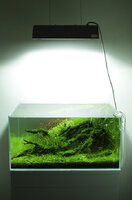
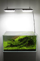
I thought I'd post two comparison photos showing the difference between the ADA Solar I metal halide with NA-Green bulb (150w, 8000K) and 2x TMC GroBeam 1500 Ultima (2x 30w, 6500K).

ADA Solar I
8685999968_f42dbf945d_o.jpg
ADA Solar I by George Farmer, on Flickr

TMC GroBeam 1500 Ultima
8684881127_5acb1d7b39_o.jpg
TMC 1500 Ultima by George Farmer, on Flickr

All camera settings are identical and the photos are straight from camera except for some re-sizing. I adjusted the white balance manually to achieve what I thought looked best - in this case 5200K for both set-ups.

Aperture - f/11
Shutter speed - 1/25 sec
ISO 800
White balance - 5200K

Both units were suspended 45cm above the water.

You can see the obvious difference in colour rendition.

What's also very interesting is the similar output in light - to the eye and PAR. PAR was 80 directly beneath the lighting in the centre of the tank, and 40 in the corners at the substrate - for both set-ups.

I'd be interested to hear which you prefer, and why?

Cheers,
George
 
The reds actually look better under the tile...that surprises me to see that. I'm gonna like the tile more as I have one, but it certainly balances the colours better in my eyes.

It's interesting regarding the par measurements!
 
The TMC tiles look better to me. They also would not generate any near as much heat as the ADA Solar MH light.
I wonder what's the price difference between those two.
 
Nice one George, the tiles look very nice indeed, any reason why you have the tiles so far apart and almost out of the edges of the tank?
 
My opinion for what its worth. The tank looks better with the tiles, but I prefer the look of the halide. Do you hsve any pictures of the tank with other bulbs in it?
 
I agree with Martin. Definitely better in tank with the tiles but the Solar wins on style.

As a general rule I'd pay more money for style & substance - a difficult thing to find in the aquarium lighting world

I went for a Juri made LED unit for my nano & I love it.

There seems to be far more choice in the US which seems a shame...
 
George it would be a better comparsion to use the NAMH bulb not the green. Then the Ludwigia SP would look kind of identical. Green paint green even the Ludwigia.

So the red color comments could be solved easily by switching in the right bulb to the Solar.

Funny i've seen the 2 shots on flickr first. Loaded in the 2 pic to different tabs. And just switched back and forth to see the difference. The way it is listed in the post not demonstrate that much the difference, but if you quickly change the images back and forth you will see that the Solar still has more power. Foreground - carpet and background is lighter. Also the right hand side wood stuff. But that is normal. Solar is still powerful in this height. LEDs are not designed to hang in this height. So if we would make the tiles lower they would look brighter.

Solar is not the brightest 150W HQI. But gives a good result growing plants. So most of the time i do not feel i need more light.

The demonstration is good as LED generate less heat and consume like half the power or less. I still would do for HQI. 🙂 Like better the shadows and the shimmering. LEDs are sharper shimmering is like a blade 🙂

Great shots anyway. Good to see them with the same settings. Would love to see with the other Solar bulb.
 
Have just looked at both of these on Flickr as viktor suggested and he is right, you can see much more of a difference flicking between the 2 shots on there. I still think the tank looks better under the tiles but still prefer the look of the halide.
On another note the tiles make the whole surrounding wall and cabinet look much nicer as there is more of a spread of light if that makes sense.
 
Tank much better under LEDs.

Agree about look. Why not get a custom bent bit of aluminium over the top? Is about £7 for a sheet cut to size and some places will even bend for you. Really easy to do (just drill two holes for the suspension cables and slips over easily). See my 259l journal for a trial effort that gives the basic overall idea.
 
You can flip quickly between the 2shots on tapatalk too and the solar does look brighter, I actually prefer it overall. It looks crisper and less yellow, except for the red plant looking washed out. You can see how Amano uses the brighter look, but lower par to his benefit, again illustrating how he uses less light than most actually think.
Not taking anything away from those LEDs though, there's no denying the shots in your journal George are outstanding and the colours look vibrant. The dimming feature will always be a winner now too 🙂
 
Interesting results regarding PAR...but enough said by me on that already. I like the ADA best on all counts...design and rendition. Fair comment Ian with regards reds, perhaps it doesn't do them as well as the TMC but the ADA greens are...deeeep man...and the colour saturation makes the TMC appear almost washed out by comparison.
 
but the ADA greens are...deeeep man...and the colour saturation makes the TMC appear almost washed out by comparison.

At first I preferred the TMC, but after seeing your comment, I compared them via a better display.
Now ADA gets my vote.
 
The greens of the ada rule but....

You can't get an accurate colour reproduction using the same white balance for two different lights.

You will have to manually set your white balance for each light using a grey card. There are far too many factors at play with your eyes, monitor, ambient light etc to be able set it by a best guess. Its been a while since I fully researched colour space and the physics of light in regards to camera sensors but I remember it hurting my head nearly as much as troi and ceg's lessons on the spectrum of light in a planted tank!! :lol:
 
Agree. But otherwise we will have much less to talk about, or we have to visit Mr. Farmer's to see from
our own 2 degree of observer angle...
 
The greens of the ada rule but....

You can't get an accurate colour reproduction using the same white balance for two different lights.

You will have to manually set your white balance for each light using a grey card. There are far too many factors at play with your eyes, monitor, ambient light etc to be able set it by a best guess. Its been a while since I fully researched colour space and the physics of light in regards to camera sensors but I remember it hurting my head nearly as much as troi and ceg's lessons on the spectrum of light in a planted tank!! :lol:
That's a really good point. I'm a bit embarrassed to say I've never used a grey card. But I can say these two shots, to my eyes, accurately reflect the colours I see in real time using the lights, even though the camera WB is the same.
 
I prefer the colour rendition of the ADA NAMH-G, greens look nicer and the photo has a nice cool environment which compliments the green. The warm look of LEDs are hard to get rid of, even with custom made 6500K DIYs. I've also tried a lot to get rid of the yellow tint post processing but its hard to balance, it may make gray rocks look too blue instead. I've read from the marine guys that changing the intensity of LEDs can produce a different spectrum of light compared to running them at full power.

If I had to choose one lighting scheme right now, it'd be a mixture of T5 tubes for colour rendition and LEDs for PAR and penetration. Basically replacing the MH in luminaires with LEDs. LEDs still don't have very good colour rendition, I think its only around 80 CRI whereas T5 tubes can reach 98 CRI. Check out ADA's videos on youtube, the plants in their Aquasky tanks don't look good at all colour-wise. Even though Amano-san claims to have use very good colour rendition LEDs. Green plants look yellow and red ones look discoloured.
 
That's a really good point. I'm a bit embarrassed to say I've never used a grey card. But I can say these two shots, to my eyes, accurately reflect the colours I see in real time using the lights, even though the camera WB is the same.
George, you don't really need a grey card to do the custom white balance for each color. A white paper or card can get you fairly closely. The white of the paper should be very close to the color of printer paper.

Cheers,
 
Back
Top