Time to start a debate: is it possible to pretty mechanically ‘test’ for a good and bad hardscape? I’m beginning to think that for 75% or more of cases*, it is, using just three rules.
For obvious reasons this post is pretty photo heavy, so apologies!
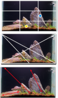
Rule 1: Focal points need to be pretty much bang on 1/3 markers, not at the same level, and one should be ‘near’ (in yellow below) and one ‘far’ in terms of depth. And each square of a 1/3 grid should be pretty distinct.
Rule 2: The hardscape should have strong lines across some core diagonals
Rule 3: The three main ‘directions’ in the tank should accentuate the lines in rule 2, and all point in different, ‘tension creating’ directions outside the tank.
Here are eleven examples to show you what I mean… (Long train journey!) First up some of the tanks I admire most. Then my own failures – think helpful to show what doesn’t work as well as what does.
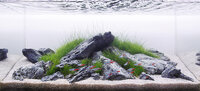
One: George Farmer’s latest aquascape fits all the rules really well.

Two: this used to be one of my all time favourites. But looking now, with the help of the lines, think loses impact because the tension lines aren’t strong enough, and the near focus point isn’t strong enough. Would it have been better with a big red plant bush on the right?

Three: just to show that stretching the rules pretty far is ok if you’re a genius.

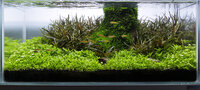
Four: Lovely, perfect example.

Five: I love this tank. The grid on this is really tight, as are the diagonals.

Six: this goes further away from ‘the rules’ than any others so far. It’s obviously brilliant, but would it be stronger if the top left quarter was a bit more directional?

Seven: a much wider tank, so it’s really two overlapping tanks. Really tight on diagonals and interesting directional flow. I love how the eye floats around this one.

* the obvious exception to all this are island and U shaped ‘scapes… but would love to see what people think, and whether there are any examples of fantastic tanks that flagrantly break these rules.
What do people think? My failures coming right up…
For obvious reasons this post is pretty photo heavy, so apologies!
Rule 1: Focal points need to be pretty much bang on 1/3 markers, not at the same level, and one should be ‘near’ (in yellow below) and one ‘far’ in terms of depth. And each square of a 1/3 grid should be pretty distinct.
Rule 2: The hardscape should have strong lines across some core diagonals
Rule 3: The three main ‘directions’ in the tank should accentuate the lines in rule 2, and all point in different, ‘tension creating’ directions outside the tank.
Here are eleven examples to show you what I mean… (Long train journey!) First up some of the tanks I admire most. Then my own failures – think helpful to show what doesn’t work as well as what does.
One: George Farmer’s latest aquascape fits all the rules really well.
Two: this used to be one of my all time favourites. But looking now, with the help of the lines, think loses impact because the tension lines aren’t strong enough, and the near focus point isn’t strong enough. Would it have been better with a big red plant bush on the right?
Three: just to show that stretching the rules pretty far is ok if you’re a genius.
Four: Lovely, perfect example.
Five: I love this tank. The grid on this is really tight, as are the diagonals.
Six: this goes further away from ‘the rules’ than any others so far. It’s obviously brilliant, but would it be stronger if the top left quarter was a bit more directional?
Seven: a much wider tank, so it’s really two overlapping tanks. Really tight on diagonals and interesting directional flow. I love how the eye floats around this one.
* the obvious exception to all this are island and U shaped ‘scapes… but would love to see what people think, and whether there are any examples of fantastic tanks that flagrantly break these rules.
What do people think? My failures coming right up…